

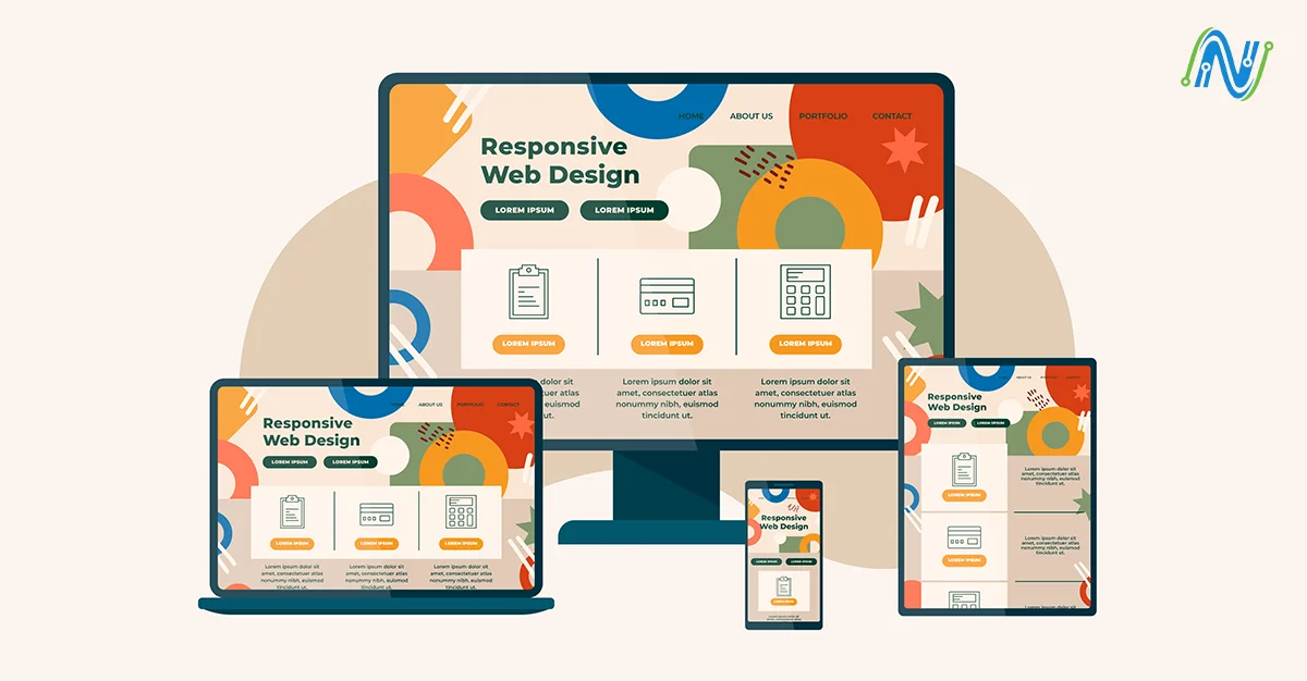
Mobile phones have become an inseparable part of our lives. Because of their extraordinary use, web developers need a mobile-friendly website. These websites are commonly designed with a particular design for a smaller screen, which makes them easier to use on a smaller device. Mobile-friendly websites are mostly designed to load quickly and cope with slower internet connections.
This article will help you design a mobile-friendly website, frameworks of websites, and how to test the working of your website. As we all know, every mobile device has different screen sizes and resolutions. A website must be flexible and able to provide ideal screen resolution experiences across multiple devices.
Steps to Develop a Mobile-friendly Website
Small screen first strategy
Small screen first is a strategy where developers design a website for mobile devices first and then scale it up for larger screens like tablets, laptops, and desktops. Mobile devices are at the forefront of the digital revolution, accounting for nearly half of the overall web traffic. As more users access websites via mobile devices, developers are leaning towards a mobile-first approach. Increasing numbers of web users on mobile devices to access the web and the trend shows no sign of stopping, makes sense for designers to develop websites keeping the mobile audience as a priority.
Implement responsive design:
A responsive website is a site that adjusts to any screen size. It can automatically change according to any screen size, whether a user utilizes a laptop or a mobile device. A responsive design is the most important factor because it gives users a great experience, that allows you to reach your website in any situation. There are some basic ways to build a responsive mobile-friendly website.
Firstly, to build responsive web design use CSS (cascading style sheet) which helps to create different layouts for multiple screen sizes.
Secondly, use a typography technique that helps the text style to adjust according to the user's screen.
Thirdly, use responsive themes and templates if you are using drag-and-drop websites.
Avoid large chunks of text:
On a mobile screen and tablet, it can be hard to read large chunks of text. These large blocks of text make it clear that the website might be overloaded and cluttered. Developers can create a website that is easy to read and mobile-friendly by introducing proper headers or making the sections of your content. This strategy helps the readers to receive the ideas quickly and easily. When you are creating your homepage try to write one idea per block and avoid lengthy passages for blogs and articles.
Latest image formats:
Images are the main part of the responsive website. Images can have a significant impact on the website. Choosing the right web image for a website is a challenging task. It requires a balance between quality and performance, flexibility and consistency, innovation and compatibility. The basic image formats are, JPEG, PNG, and WebP these are known as raster formats. On the other hand, SVG, AI, and EPS are known as vector image formats. Developers use both formats for graphics like logos, icons, and illustrations they mostly use SVG because of its scalability, it can change image size without losing its quality. SVG enhances the performance, it can load fast because of small images and icons. For photos and complex images, developers use WebP and JPEG give excellent compression and quality. With WebP format images become more optimized for websites and provide better compression with minimal quality loss. These latest image formats ensure that perform well on responsive websites.
Optimize image sizes:
Website images and animation are supportive of engaging the user. So that is why it is crucial to optimize image size for the satisfaction of the user experience. Optimize image size provides a more fitting view of the image and other web content. While creating a mobile-friendly website, we need to focus on the website's performance. Having large image files can reduce a website's page loading speed. To maintain the speed you can use an image content delivery network help to optimize the images for a website by compressing and caching them. This can speed up the loading of photos on websites by improving performance.
Minimize pop-ups:
Whenever the user enters the website pop-ups will appear on the mobile screen However, many internet users are irritated by pop-ups. To build a user-friendly website, it is important to consider the likes and dislikes of the user's interests. Therefore, there are many alternatives to obtain leads and feedback. Interactive CTAs are very effective alternatives to pop-ups. Once a reader clicks the link a small widget allows the user to enter their email and other details. Slide-in banners are another option in place of pop-ups. These are the types of online advertising that allow you to display banner ads in the corner of the website.
Include a search function:
Adding the search function improves your website's functionality which can help the user to find information quickly and easily. To search easier, the search bar is usually at the top of the homepage with better contrast. For a website, it is compulsory to contain a large collection of information to create filters for their search function. With the help of filters, users can set specific criteria that encourage them to refine their search and help them save time they spend on irrelevant content.
Exclude Flash:
Flash makes your website slower it affects SEO (Search Engine Optimization) and interrupts the user interface. Mobile devices are unable to work because Flash makes your website slow and it will take too much time to load.
Insert Viewport Meta tag:
The viewport meta tag is an HTML component that helps the developers maintain the website's display on the mobile phone. By using Viewport developers can control the width and scaling and give commands to the browser to resize the web page, it ensures that their website's mobile version displays properly on multiple devices. By inserting the viewport meta tags in the website they can also control the layout of the Hybrid app on a mobile device.
Reducing HTTP Requests:
To improve the user's access to the website and their overall web browsing experience it is crucial to reduce your site's page load time by making fewer HTTP requests. Page loading speeds directly affect what users think about using a website. To minimize the requests several things help to boost the speed of the site. Developers should reduce image size so smaller images are the most reliable, and use a Content Delivery Network (CDN) that helps to store your website data on the nearest local server to visitors to enhance your load time. Reducing HTTP requests not only speeds up the site but also improves SEO, boosts search rank, and achieves a high conversion rate.
Website speed optimization:
Speed optimization is a set of techniques to make your website as fast as possible. Low speed increases frustration among the users and they lose their focus. If your website takes a long time to load the information, the user will lose their focus within 0.3 to 3 seconds and close the browsing window which affects the reputation badly. Making your web page load faster has positive impacts, leads to a high conversion rate, and higher ranking search, and gives an overall better user experience. There are several reasons such as large image size, Slow network connection, traffic volume, and use of heavy CSS. For a mobile-friendly website, developers must focus on these things to enhance the website's speed.
Importance of SEO:
Mobile-friendliness has become an essential part of search engine optimization (SEO) because of the priority Google places on the mobile version of websites. A wide range of people access websites through their smartphones and tablets, it is compulsory to optimize the website for mobile phones. So that users can easily interact with all your content and rank well in search results. A well Optimized website is easy to navigate on mobile devices which engages the users to stay on the website and meet their needs. Providing a smooth experience for mobile users leads to a high conversion rate, opens up more business opportunities, and effectively targets mobile traffic.
Test on a real mobile device:
Testing your website is one of the best methods to ensure, the website provides the best user experience. Through testing on real devices, you will be able to find the solution to any issue that may be faced by the user. To confirm that the user can browse easily on any mobile device, test your websites through browsers, devices, and operating systems. Testing websites on devices might be challenging without access to a thorough test framework. currently, all companies can't afford a mobile testing lab. A real device cloud is commonly used because it requires no maintenance and is also a superior option.
Frameworks for responsive websites
In modern web development, a responsive website framework is compulsory to create a website that functions well on all devices. The framework is a tool kit that helps the developers to create a site that adapts smoothly to multiple screen sizes. It assures the sites are user-friendly on all devices, reduces bounce rate, and enhances SEO performance. To build a dynamic and accessible site learn about different responsive frameworks which are:
Bootstrap: is known for its easy-to-use and detailed records. This framework has built-in elements that smoothly integrate and increase your workflow. It offers pre-design layouts and templates that help the developers create visually appealing sites and a grid system that makes the site straightforward. It is widely used in corporate websites, blogs, and admin dashboards.
Semantic UI: is a responsive website design framework that uses human-friendly HTML to create responsive layouts that are easily understandable and customizable. It is ideal for projects where code readability and maintainability are priorities. Semantic UI is open-source and affordable for all team sizes.
Tailwind CSS: is a very popular choice in the web design community that allows developers to create your application in their markup. This framework does not rely on predefined styles. Tailwind CSS is a great framework because of its flexibility and freedom to create custom utility classes, color palettes, and breakpoints. These all are essential when building a sleek and consistent design.
Foundation: this framework gives the developers a solid foundation to create a site that adapts to all screen sizes. The foundation's robust features include mobile-friendly forms and built-in support for accessibility standards, making it a versatile tool for modern web development. This framework is suitable for complex and large-scale projects.
Bulma: is well suited for startups, personal portfolios, and content-driven websites. This framework's strengths are ease of use, simplicity, and elegance in its design. Bluma's has a simple grid system that makes it easy to add or subtract columns to customize your layout.
Mobile Website Design Examples
Before creating your site Here are a few examples of responsive mobile website designs you must visit and see what their quick-response web design approach looks like in practice, this will motivate you to develop the optimized website.
1: Commercial Coop (https://thecommercialcoop.com/)
2: Stenco Constructions (https://www.stencoconstructions.com/)
3: My scribe (https://www.myscribe.us/)
Mobile Friendliness Evaluation Techniques
A mobile-friendly website should always be designed to ensure your content is legible even using small screens. Text, images, and animation fit the screen sizes, and users can easily use them without zooming in. The website is designed to be efficient and allow people to perform critical functions with their mobile. There are the following tools that can help you to understand if your site meets these benchmarks.
Google's mobile-friendly test: Google gives us a free tool where you can simply enter your website and it gives you instant feedback, it also provides suggestions for improvement.
Google search console: If your website is registered with Google search console You will easily access the mobile usability report that helps you to find the issues on your mobile device.
Core Web Vitals: These are necessary for mobile users' experience and to make sure your website meets Google's performance benchmark. Core Web Vitals also affect the SEO and user experience.
Pingdom tools: This website testing tool checks the speed and how your site loads on mobile. Slow speed can negatively affect mobile user experience, so it is essential to optimize your site speed.
Browser stack: is a paid tool, it gives accurate testing by running your website on the actual device instead of stimulations. It helps to test your website on different platforms like Android, iOS, and Windows.
Conclusion
Designing a responsive website is no longer an option but it is important in today's mobile-dominated world. By following the steps developers can create a smooth website, well-equipped to meet the demands of the users. and enhance the browsing experience. Leveraging modern frameworks helps streamline development while ensuring cross-device compatibility. Developers can ensure that your website provides a seamless experience for users across various devices. Testing and resolving the issue make sure that the website is accessible and appealing on mobile devices to engage users. Ultimately, these techniques will not only enhance user experience but also improve the website’s performance and visibility, leading to greater engagement and success.
You just step into the mobile era, optimize your website, and access the users wherever they are. At Nodesol Corp, we stay with you to develop a responsive website. If you are ready to evolve your site contact our experts and discuss we will be with you in your projects.


